
VariloVIMS

From operational data to decisions — VIMS dashboards

A safety report is useful when it comes from data already in the system, not from a spreadsheet stitched together once a quarter. In VIMS the indicators come straight from operational registers, so you never have to choose between being current and being credible.

  • Indicators
  • Timeliness
  • Filters
  • Data export
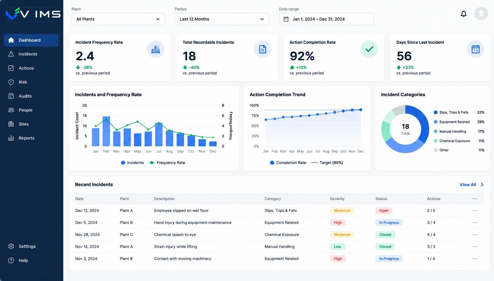
VIMS analytics — EHS dashboard with incident indicators, action completion, trend charts and filters by site and period

The problem is not missing data

In most organisations safety data exists. The problem is that it is scattered and comes from different points in time. Incident counts sit in one spreadsheet, action status in another, training deadlines with HR and inspection results in managers' inboxes. Building a coherent picture takes days and produces a summary that is already out of date on presentation day.

The consequence is worse than lost time. When a report is made manually, it is made rarely. When it is made rarely, it serves reporting rather than management. Decisions are taken on impressions and data arrives afterwards as justification.

VIMS analytics reverses that order. Because incidents, actions, inspections, training and reviews are recorded in one environment, a summary needs no consolidation. An indicator is a view over the same records specialists use every day.

What is worth measuring, and what only looks good on a slide

The most common safety indicators describe the past: accident counts, days without an event, frequency rates. They are necessary but they only react after something has happened. Organisations that genuinely improve safety add leading indicators.

The most useful include: corrective action timeliness, hazard reports per area, delivery against the inspection plan, the share of actions closed after effectiveness verification, and overdue training and examination dates. These tell you whether the system works before an accident occurs.

The breakdown matters just as much. A total incident count at a site of seven hundred people says almost nothing. The same number split by area, shift, work type and cause category shows where to concentrate resources. That is why filtering by site, department, period and category matters more than the number of available charts.

What the analytics layer shows

Action completion status

Open, in progress, overdue and closed actions — broken down by owner, area and originating source.

Trends over time

Month-by-month change in incidents, reports and inspection findings, with period comparison.

Organisational filters

Breakdowns by site, department, area, event type and cause category instead of one aggregate number.

Deadline overviews

Training, examinations, inspections and document validity in one view of upcoming and overdue dates.

Site comparison

Sites and areas compared on the same categories, which keeps the figures genuinely comparable.

Export for reporting

Results can be exported and reused in internal reporting or management review material.

From record to management decision

Analytics is not a separate system — it is a view over data created in daily work.

  1. 1Recording incidents, inspections, actions and deadlines in the modules
  2. 2Consistent categories and organisational structure
  3. 3Aggregation of data into operational views
  4. 4Filtering by site, area, period and category
  5. 5Trend analysis and comparison between locations
  6. 6Decisions and tasks returning to the action register

Modules using this layer

VIMS module

No more action lists in a spreadsheet. Every action has an owner, a deadline, a status and an effectiveness check — all in one view.

Explore the module

VIMS module

Report an event in seconds, run the root cause analysis, plan actions and close the case with complete documentation in one place.

Explore the module

VIMS module

Plan an audit or round, run it from a phone, record nonconformities and launch actions immediately — without retyping results into a spreadsheet.

Explore the module

VIMS module

See in one view who holds valid training and qualifications, whose certificates expire soon and what is missing for a given job.

Explore the module

Medical examinations

An expired medical certificate means a worker cannot be allowed to work. With a hundred people a spreadsheet still copes. With several hundred, turnover and shift work you need a register that raises upcoming dates by itself.

Explore the module

Registers and inspections

A plant runs a dozen parallel registers: cranes, pressure vessels, forklifts, extinguishers, hydrants, electrical installations, ladders, hoists, gates. Each has its own cycle and its own owner. This module brings them into one register with one calendar.

Explore the module

Dashboards for different audiences

The same dataset must serve very different audiences. The EHS specialist needs a backlog list and specific records to close — their view is operational and behaves like a task list. The area manager needs a narrower scope limited to their territory but with full detail.

Management needs the opposite: fewer records, more trends and comparisons between locations. The most common rollout mistake is showing the board an operational view — it ends in a discussion about individual entries instead of direction of travel.

Auditors and people preparing the management review form a separate group. For them the key is reconstructing history: when an action was raised, who closed it, what evidence was attached and whether effectiveness was verified. Analytics without access to the source record is useless here.

Data quality decides indicator quality

A dashboard does not fix inconsistent data — it magnifies it. If the same cause is recorded once as 'human factor', once as 'inattention' and once as 'operator error', no chart will show a meaningful distribution. Agree a closed category list before reporting goes live and stick to it.

The second issue is completeness. An action timeliness indicator is only worth something when actions are registered in the system rather than agreed verbally in a meeting. The first months after go-live usually look worse — not because things got worse, but because the real state finally became visible.

The third is interpretation. A rise in hazard reports is almost always a positive signal showing growing trust in the system. Treating it as deteriorating safety and penalising reporters is the quickest way to stop reports for years.

Questions about analytics and reporting

Are indicators calculated automatically?

Dashboards use data stored in operational registers, so no manual spreadsheet consolidation is required. The set of available views is always confirmed against the current version.

Can several sites be compared?

Yes, provided shared categories and a shared organisational structure are used. That is the usual precondition for meaningful comparison in multi-site organisations.

What does an area manager see?

Permissions can limit visibility to a chosen area or site, so managers work on their own data while aggregated figures remain available to supervising roles.

Can data be exported?

Yes, results can be downloaded and reused in internal reporting, management review material or a summary for an external client.

Which indicators do you recommend at the start?

Four usually work best: action timeliness, reports per area, delivery against the inspection plan, and overdue training and examination dates.

Are the numbers shown on this site real?

The images show the interface layout and the values on them are demonstration data. In a live demo we show dashboards running on real data from a test environment.

Other platform layers

VIMS Field

Scan. Complete. The data is already in the process. VIMS Field moves selected activities from the desk to the phone so an observation made on the shop floor does not end up as a note in a hi-vis pocket.

See

VIMS Intelligence

AI assists. People approve. The intelligence layer shortens the most tedious part of working with documents and data, without hiding the source or taking over responsibility for the decision.

See

See a dashboard built around data like yours

In a demo we can recreate your organisational structure and show what the summaries would look like in practice.